Home Depot Task Management
Project Overview
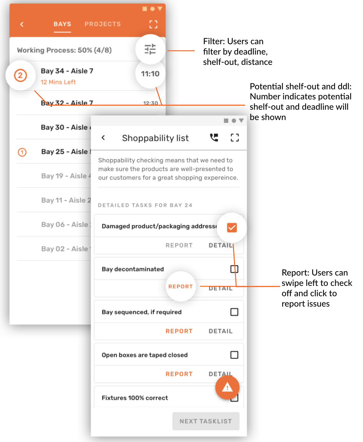
My team and I worked with Home Depot as our industry partner to figure out how to help their associates with task management and efficiency. They had too many tasks and wanted a way to balance customer needs and store needs. We designed a better system for bay checking (their main task) and project management.
Team Members
- Yannu Li
- Xi Chen
- Yizhou (Fred) Liu
My Role
- Contextual Inquiries
- Task Analysis
- Paper Prototypes
- User Feedback Sessions
- Quantitative Data Analysis
Research Methods
Competitive Analysis
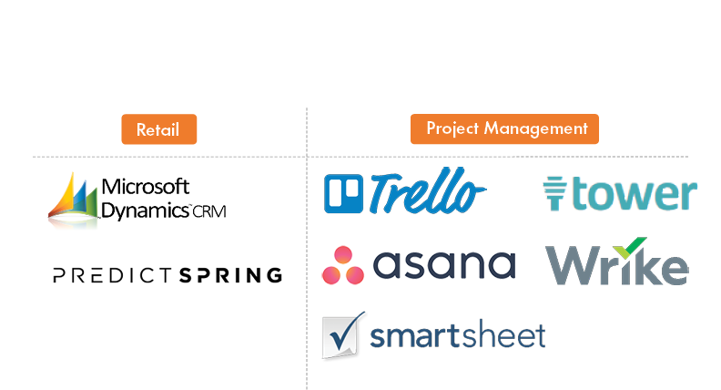
During our competitive analysis, we found that there are several generalized products that effectively handle project management, but few retail specific project management systems on the market. Home Depot associates move around a lot on the job and require a more retail specific approach to help them manage tasks.
Observations
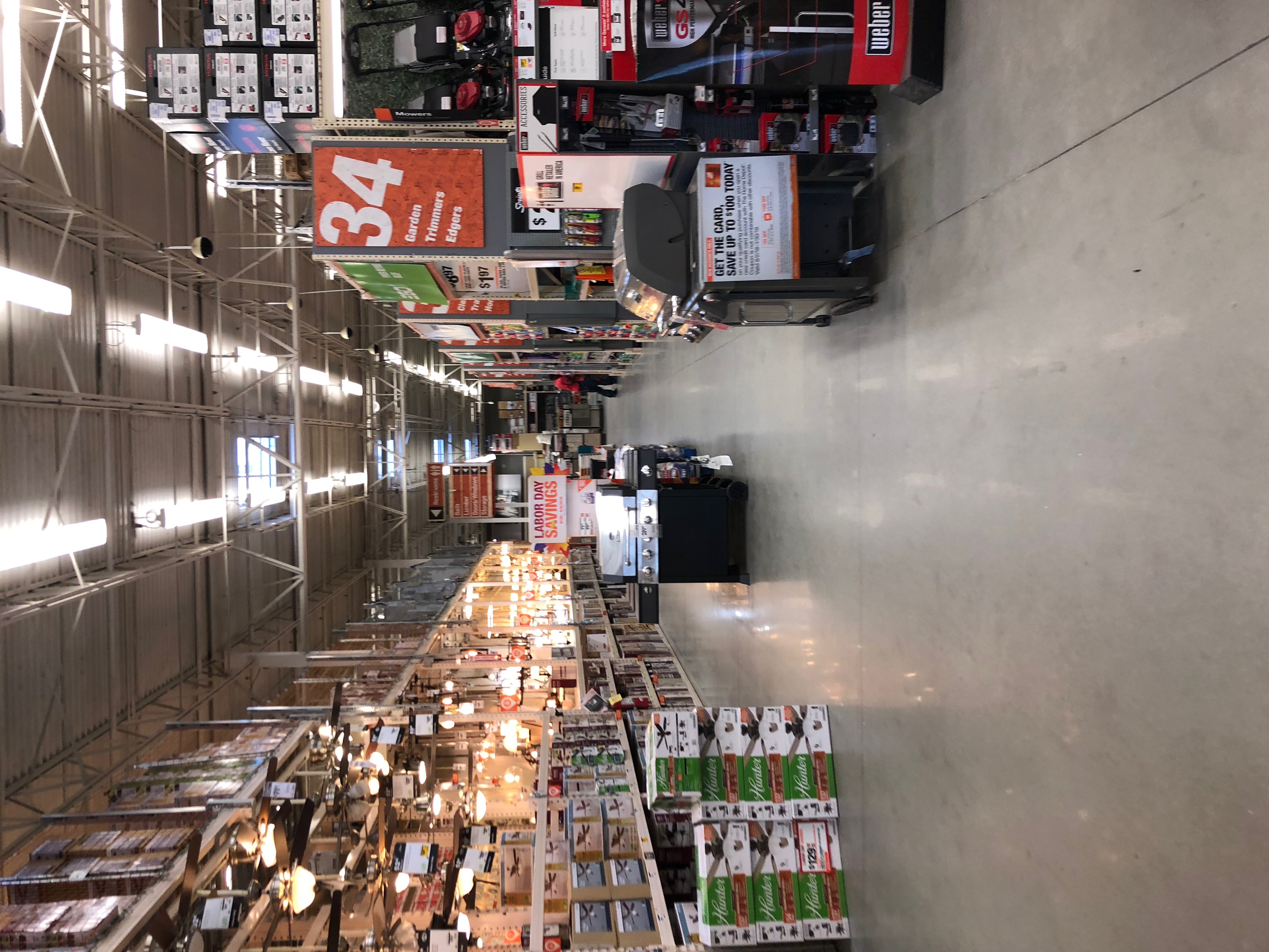
We discovered the Home Depot store is noisy, maze-like, and huge. The internet coverage in the store is spotty. We needed to keep these considerations in mind as potential limitations when we went into our design phase.
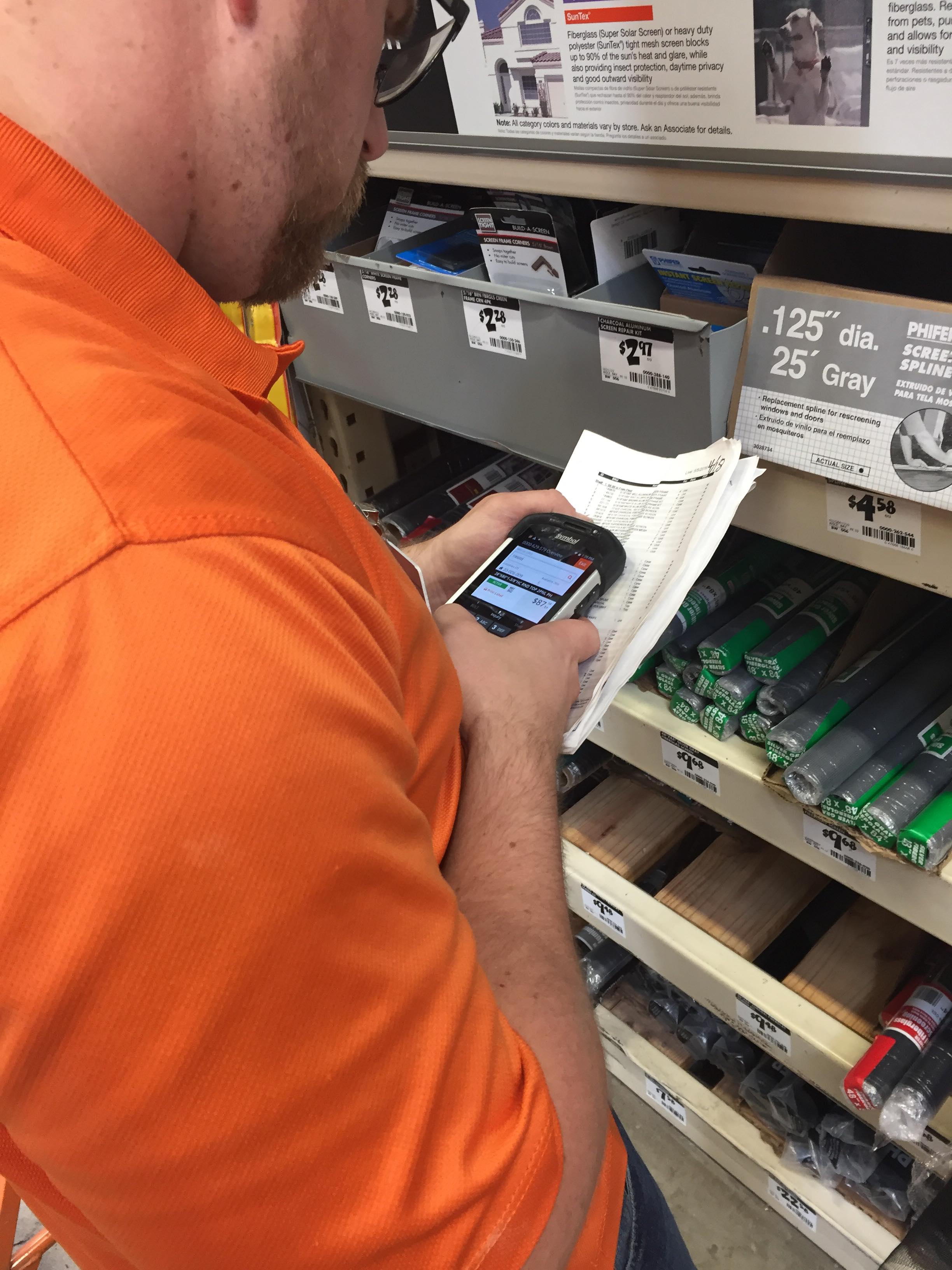
By observing the associates, we also realized that projects were a big part of an associate's daily work in addition to bay tasking. We gathered a list of tasks an associate may complete on a project.
Expert Interviews
We interviewed 2 experts who developed software for the associates to understand company goals, customer needs, and technological limitations.
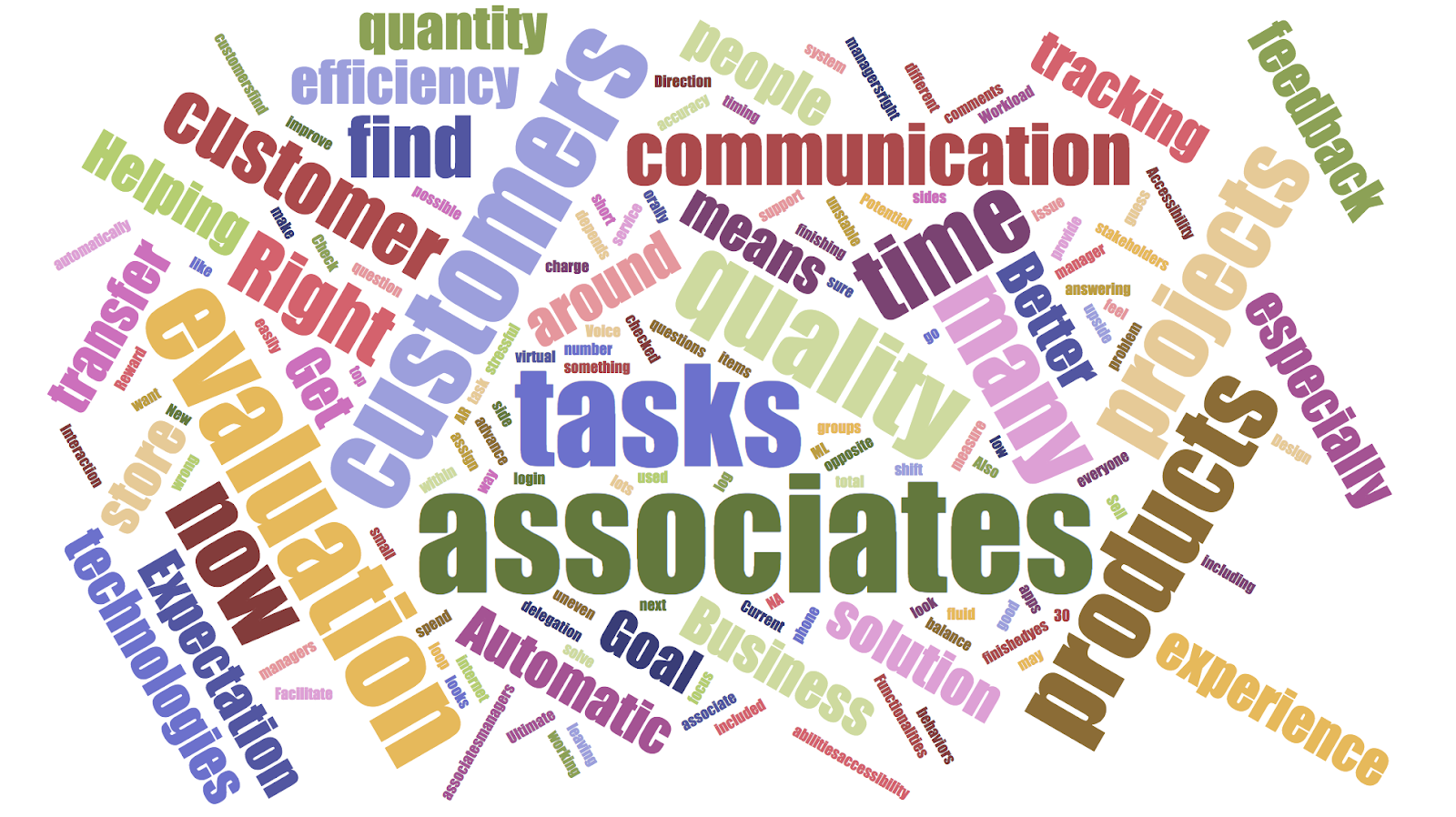
Supervisors struggled with communication with associates, delegation of tasks, and how to measure quality of an associate’s work. Associates struggled with too many tasks and projects.
The experts suggested looking into key technologies such as machine learning, AR, and voice interaction to allow for automation of key processes and better accessibility.
Contextual Inquiries
We conducted 5 contextual inquiries, asking users to go through one of their daily tasks as we observed their process. To analyze the results, we used affinity mapping to identify common pain points.
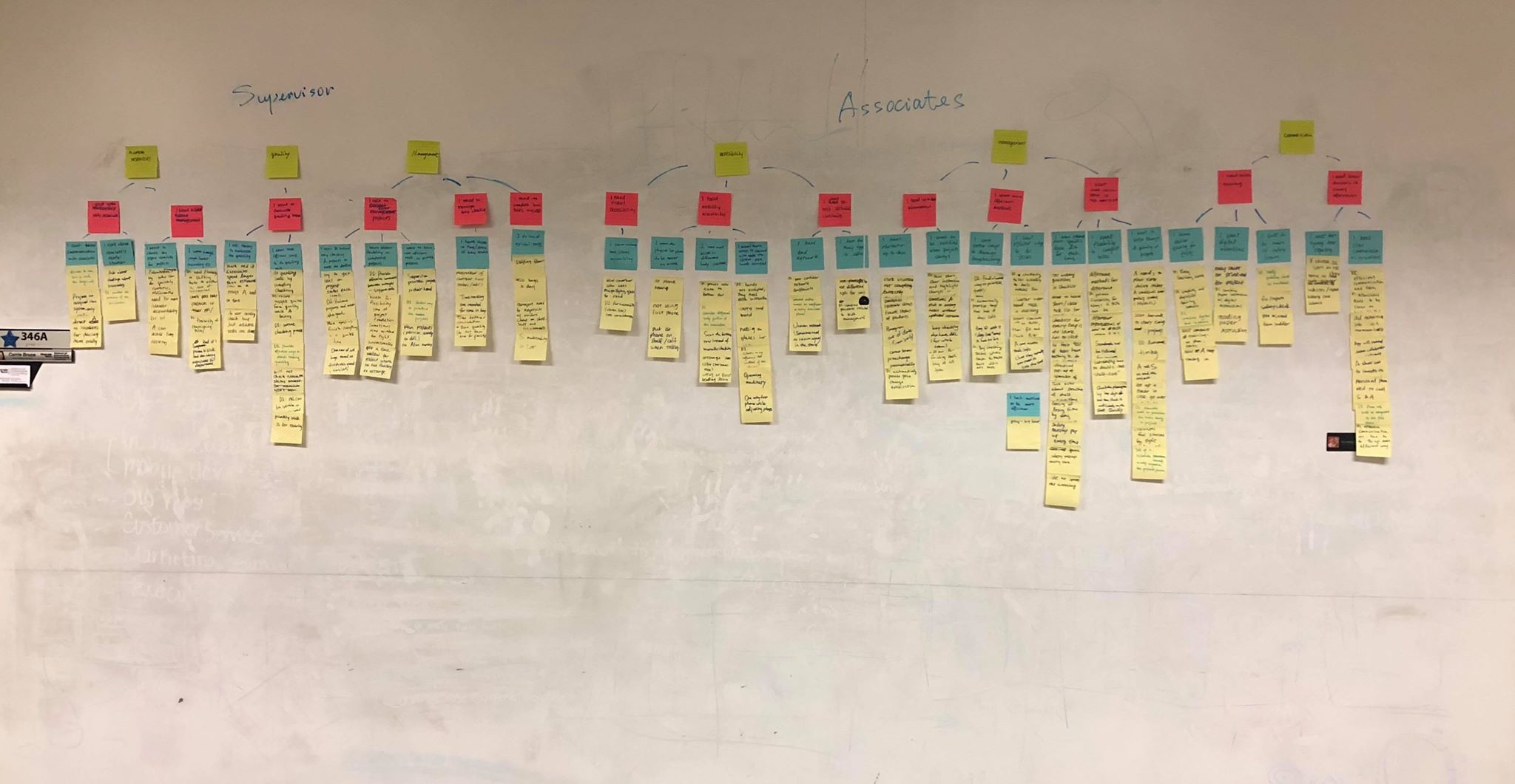
For supervisors, we found the main challenge areas to be:
- Managing talent: need to choose the right associates for the right projects
- Quality management: need efficient ways to evaluate quality
- Task management: need flexible, efficient ways to manage projects
For associates, we found the main challenge areas to be:
- Accessibility: need increased mobility and visual accessibility
- Task management: need better methods for bay checking
- Communication: need better channels to convey information
Synthesis of Findings
Jobs-To-Be-Done (JTBD)
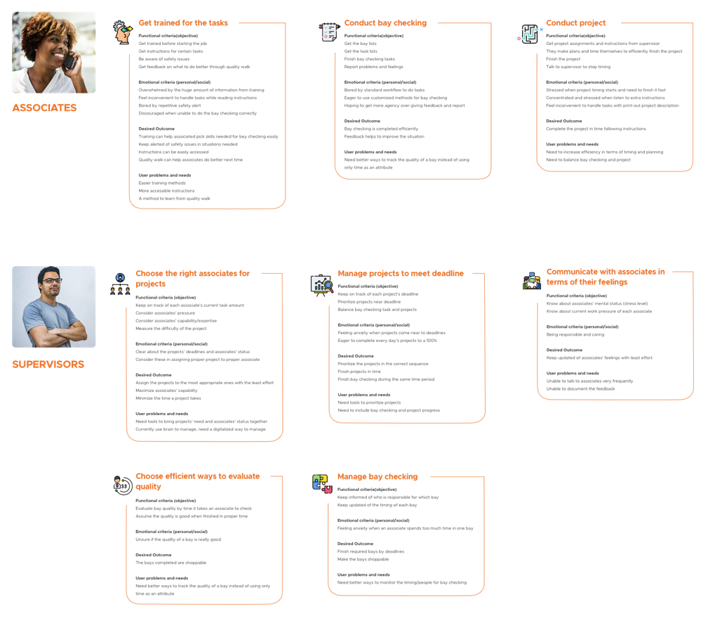
To better understand how our users felt in relation to the tasks they had to do, we decided to use the Jobs-To-Be-Done (JTBD) framework. This method takes the place of personas and makes our analysis more task centric.
Empathy Maps
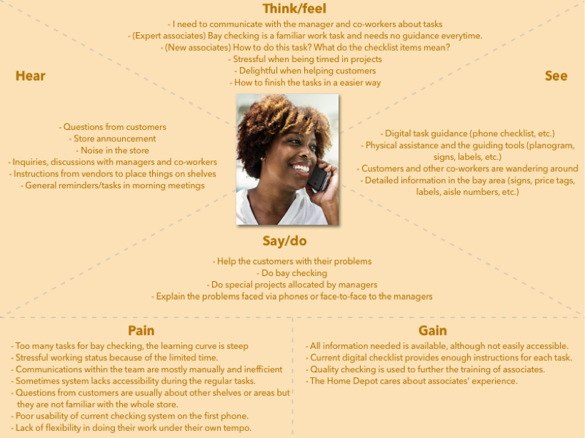
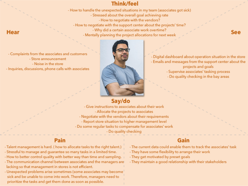
We also wanted to understand our users' emotions better. We created empathy maps to be able to step into their shoes for a day to fully grasp their experience through different senses.
Associate Empathy Map:
Supervisor Empathy Map:
Task Analysis
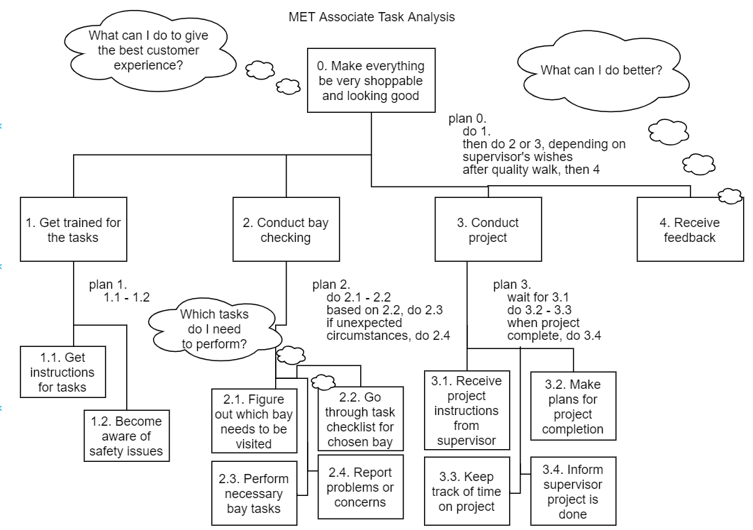
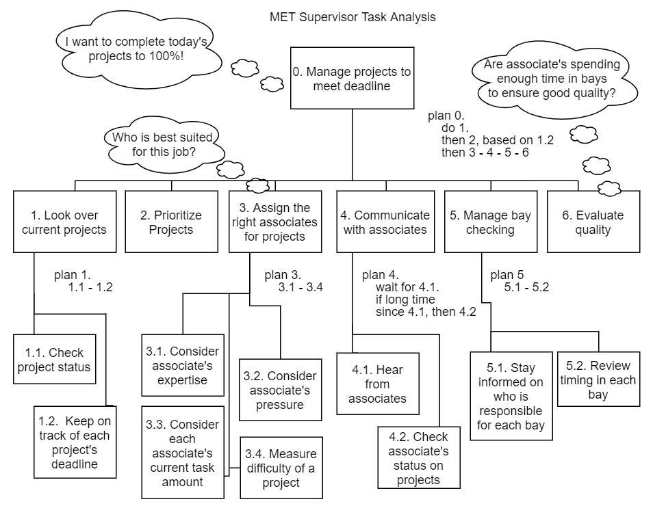
To ensure that our system would account for all the tasks that our users must complete, we did a breakdown of the task for both associates and supervisors through task analysis. This helped us get a sense of the work flow and all the main components that we would need to consider in our design.
Associate Task Analysis:
Supervisor Task Analysis:
Design Implications
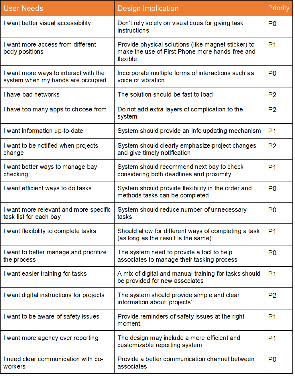
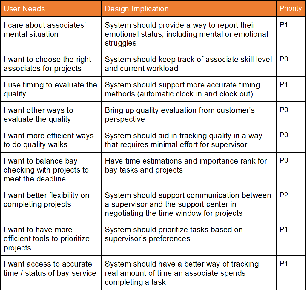
Taking all of the above findings into consideration, my group and I held a brainstorming session where we considered the design implications. Then we grouped our implications together based on common themes, then prioritized which implications were the most important to address in our design. The tables below show the results.
Our priority system can be read the following way:
- P0 = Very Important
- P1 = Somewhat Important
- P2 = Not As Important
Design Implications for Associates:
Design Implications for Supervisors:
Design
Divergent Brainstorming
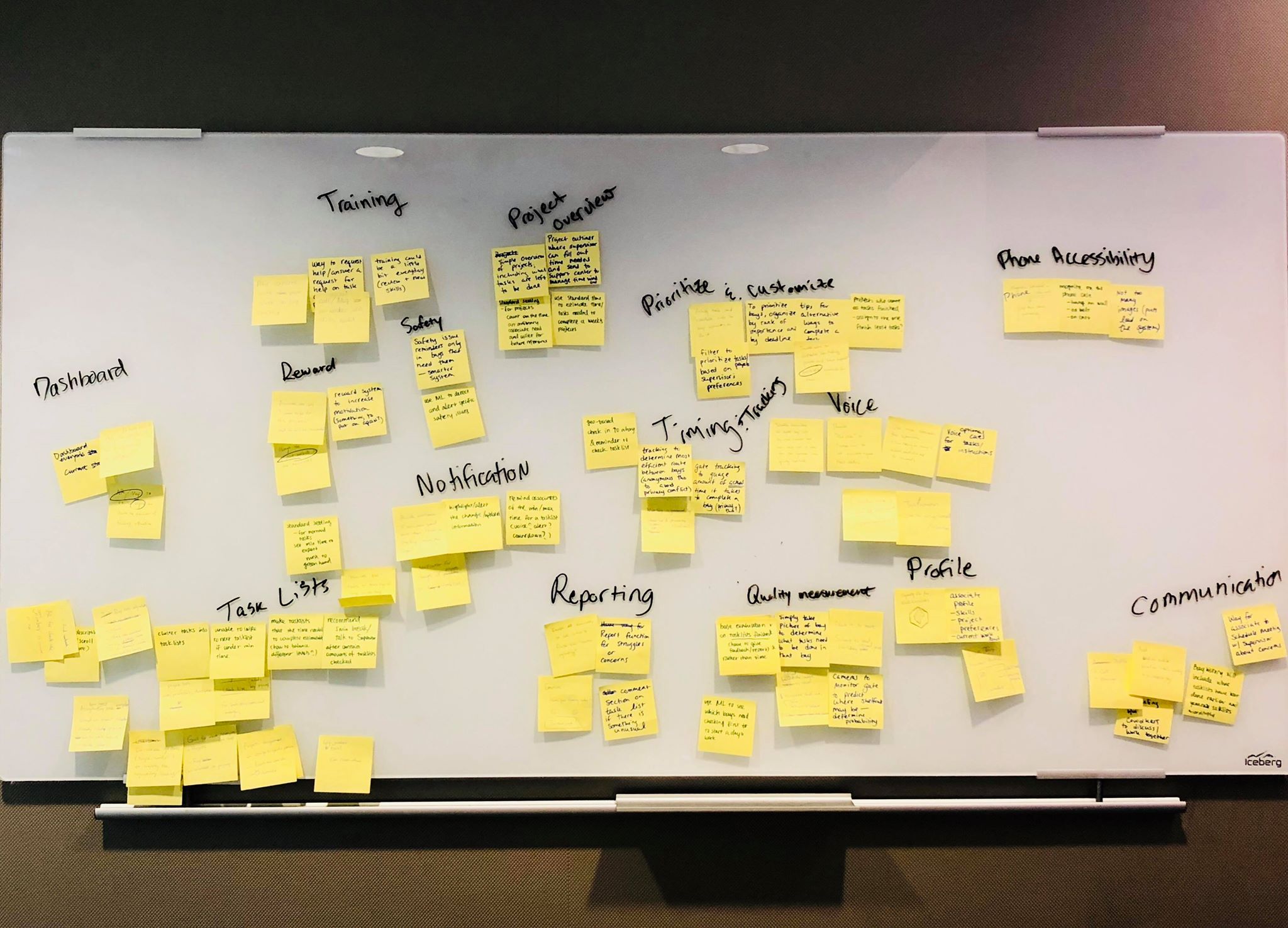
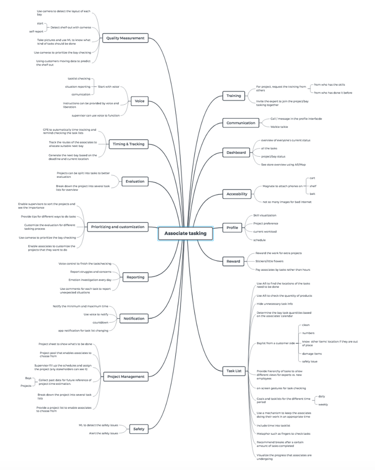
As we considered our design implications, we wrote down any ideas we had individually on sticky notes. We then categorized the sticky notes and created a mindmap to better organize all of our ideas.
Convergent Brainstorming
To converge on the best ideas, we first plotted all the possibilities on a feasibility versus creativity chart to help us focus on the ideas with the most potential. We focused on the top three ideas and sketched out alternatives for each.
Idea #1: Standard Tasking App + Supervisor Dashboard
This solution would be a redesign of the current tasking app. It would cluster tasks into categories, allow for novice v. expert work flows (free-style option), and have reporting. The supervisors dashboard would give a calendar view that showed the deadlines for all bays and projects.
Idea #2: AR Tasking
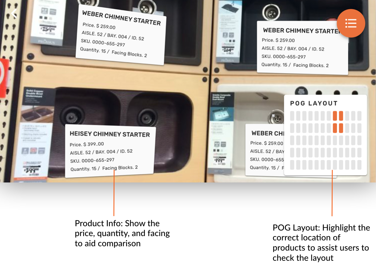
Associates can hold up their phone to a bay and take a photo. Then machine learning can be used on the photo to identify shelf-outs and price changes. Using AR would help the associate to complete their tasks faster. When finished with a tasklist, they could upload a photo for quality checking.
Idea #3: Voice for Tasking
With this solution, associates would put on headphones to listen as the system guides them through the bay checking process. They could ask for assistance or clarification at any point and would simply say "Done" to mark a task completed. They would have a visual app for support if the voice system failed.
Feedback Sessions
We conducted two rounds of feedback sessions. After the first round, we consolidated the best features of the 3 concepts into one system.
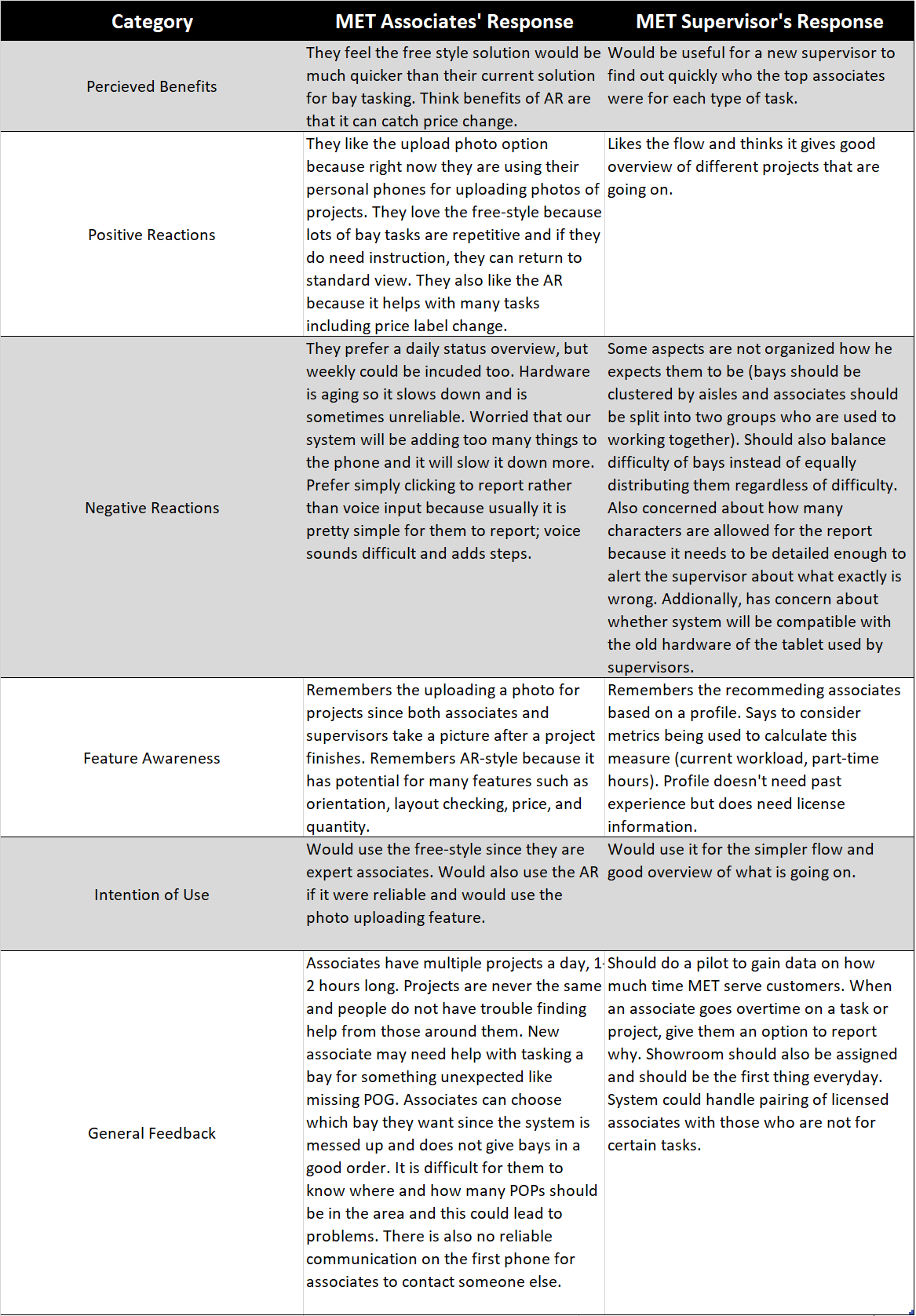
We recruited 2 associates and 1 supervisor in the second round. We asked them to think aloud as we went through the prototypes of the combined system (included free-style, AR, and voice features). The table below shows the synthesis of our findings from the second round of feedback.
Final Design
We corrected all the issues we had identified in the feedback sessions. Below is a breakdown of the final design.
Associate's App
-
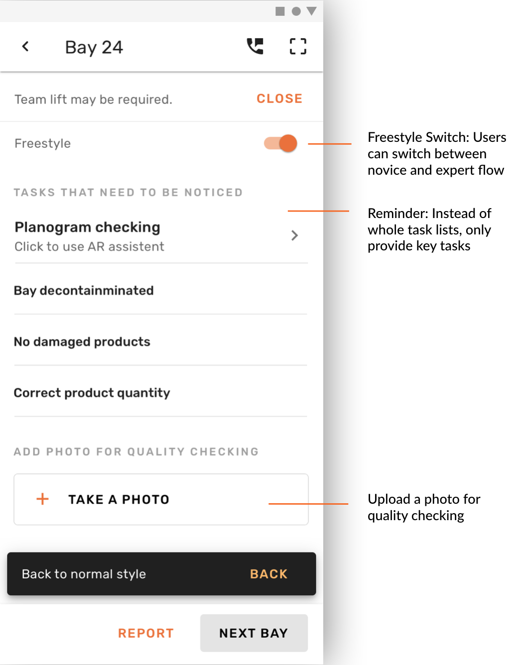
Bay Overview: The home screen displays bays that associates are required to check daily. Potential shelf-outs and the deadlines for bays will be marked. Tasks are categorized into several task lists for better management.

-
Expert Flow: Once an associate has gained enough experience, they can use the free-style method for checking tasks. This means that associates do not have to check tasks one by one. Instead, they will only be reminded of a few key tasks.
-
AR Planogram: Instead of using the paper planogram to check layout and prices, our system will scan all the product barcodes and provide this digital AR planogram to assist comparison and completion of bay tasks.
-
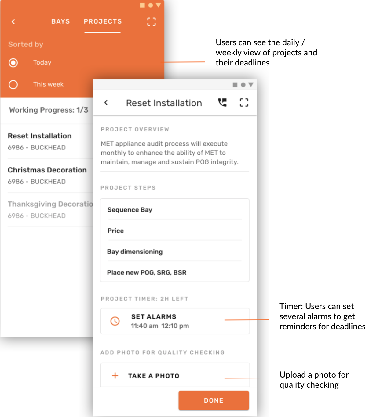
Project Overview: This screen displays the projects that associates are required to complete daily and weekly. Users can set timers for the project deadlines and upload a photo to supervisor for the quality checking.
Supervisor's Dashboard
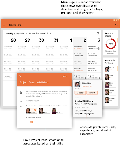
This tablet application gives a calendar overview for supervisors to better manage deadlines and associates. They can view detailed information, associate profiles (which shows their skills), and goals for the week. It also recommends which associates would be best for a certain task.
Evaluation
Methods
We conducted two different evaluation sessions: one with experts (Home Depot UX designers) and one with our users (MET associates & supervisors).
For our expert evaluation, we used the heuristic evaluation method. We gave them the following heuristics to consider:
- Match between system and real world
- Flexibility
- Efficiency of use
- Accessibility
- Error prevention
- Consistency and standards
- Aesthetic and minimalist design
When they found an issue, we asked them which heuristic they thought it violated and took note. We tested with 6 experts.
For our user evaluation, we used moderated user testing. We used the following procedure:
- Give introduction to project and design solution.
- Ask user to complete tasks.
- For associates:
- Complete regular bay checking and use AR to complete a tasklist.
- Use free-style to complete a tasklist.
- Complete a project.
- For supervisors:
- Get an overview of the week.
- Assign a project to an associate.
- Check the status of bays 15-20.
- For associates:
- After each task, give After-Scenario Questionnaire (ASQ) to measure the user's satisfaction of the task.
- After all the tasks have been completed, administer SUS form to measure overall usability of the system.
- Thank user for their time.
We asked users to think aloud as they completed the tasks and we took notes. We tested 3 associates and 1 supervisor.
Results
Our overall SUS score was 85.83, which met our target of 68 for a passing system. We used the rest of our qualitative and quantitative results to inform the changes we would make to our design in the future. Some of the major changes we would make include the following:
- Add descriptions for key features.
- Make key features more discoverable.
- Improve the flexibility of the AR planogram.
- Fix wording problems to match users' mental models.